Introducing Sitback’s refreshed visual identity: Bound by optimism
Who is Sitback?
Sitback was founded on the understanding that there was a gap in the digital experience market; a gap that could be filled by talented, inspired, and socially driven humans. Through the years, Sitback has evolved into an organisation with a single goal in mind, to create exceptional experiences; for customers, clients and importantly, our people on the ground.
In the beginning, Sitback was led by an ambitious group of web developers. People who understood the “how” of building websites. But as with many development teams, we also understood why it is important to build digital experiences that are usable, convenient, and proactive – and not just technology-driven.
With growth, we realised that the Sitback capability offering would need to become more focused and mature. It became pivotal to Sitback that involving a broader group of professionals would become our differentiator in offering innovation and value to our clients.
While Sitback focused on optimising a skilled team, it became apparent that the brand was not keeping pace with our evolving skill set. So we decided to shake things up…
The Sitback brand
We built a team based on mutual respect and a desire to impart those values to our customers. We are and always have been proud of the evolution of our culture and reputation. As we went along, we realised that the original Sitback brand and website were no longer showcasing our work, or who we wanted to be going forward.
The Sitback brand, as with many others, grew organically and was driven mostly by necessity. While we focused our attention on building great websites for our customers, we allowed our own website to fall behind. We realised that Sitback as a brand needed a more purposeful change.
With a well-rounded team of developers, psychologists and creatives, it became obvious that we had taken Sitback to a new level. If we wanted to inspire and innovate, we would need to elevate our brand and website. But why is this so important to us?
Because we aspire to lead by example.
By being brave enough to hold a mirror up to ourselves and honestly evaluate where we are at in our journey, we know we can instil confidence in our community as professionals, developers and creatives.
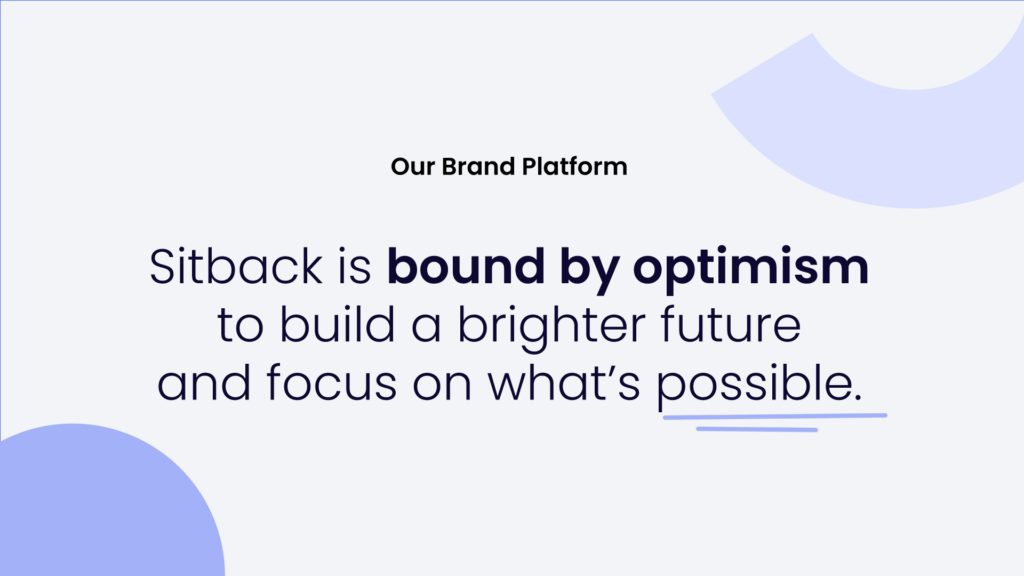
A brand and website refresh has also given us the opportunity to promote our core mission:
“We exist to create and inspire exceptional experiences for our clients, their customers, and our people”.
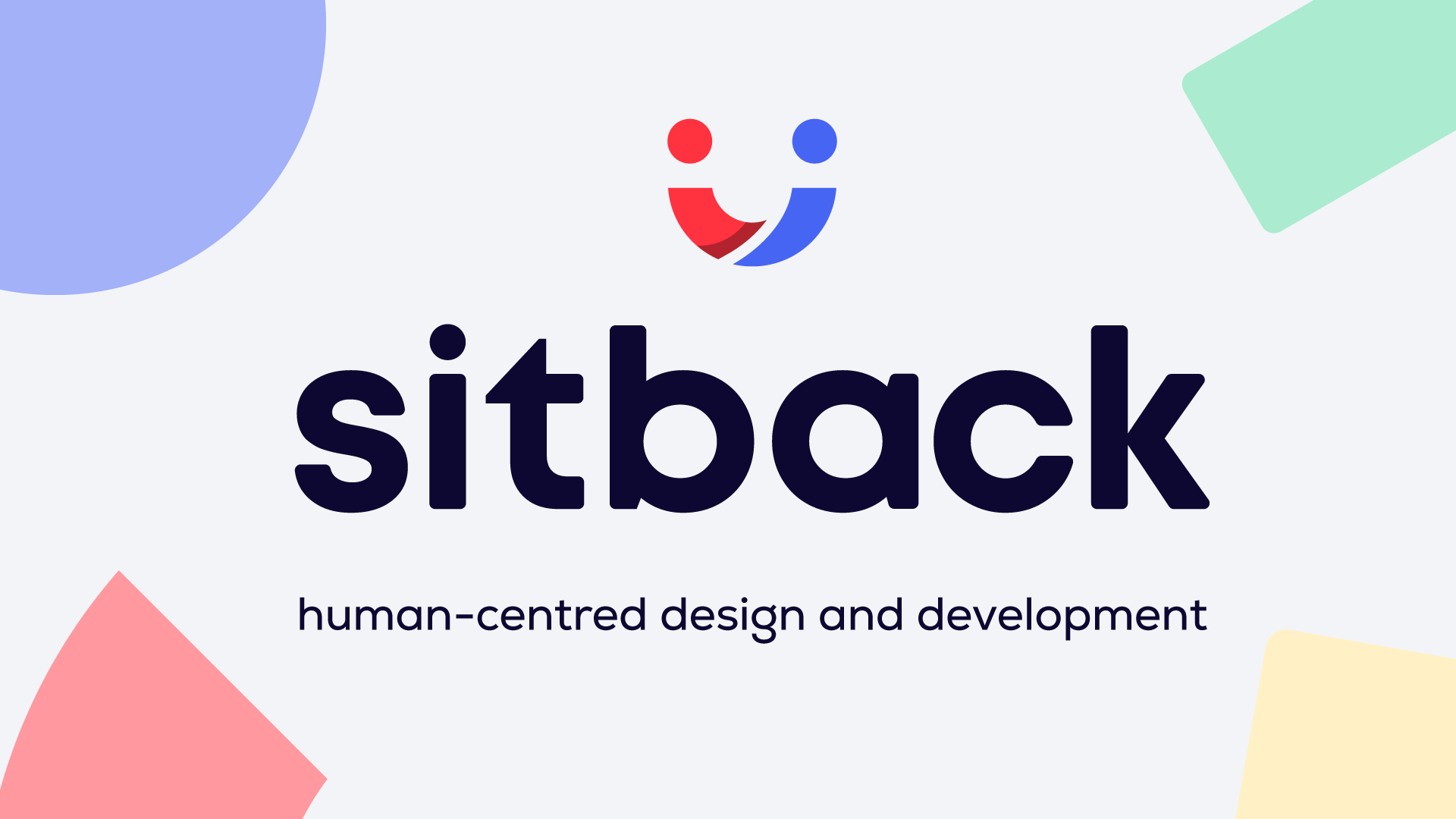
The logo story
The old red and white SitBack logo had run its course. While it attracted attention in the sea of passive tones of blue logos in the technology landscape, our research suggested that the red background colour was perceived as aggressive and the typeface had become inconsistent across brand assets. Our customers also fed back to us that our work for them was more compelling than the story our website was telling!
So, it was time for the old red and white logo to go. We got to work on redesigning our brand and logo, and we are super proud of our work! The Sitback logo has a deeper meaning, and a lot like Sitback itself, it is a dynamic, multi-faceted, and all-encompassing reflection of our brand DNA and company personality.
Connection
The two human ‘figures’ coming together in our logo are driven by a human-centric approach to how we work and the work we create. We are constantly striving to connect people through exceptional digital experiences.
The connected journey
By joining the dots (a representation of two minds) with the lines that represent human bodies, we further drive home the point that people need people. This life is about connecting journeys, both online and in person.
Optimism
We are bound by optimism and the emotion and purpose that our work brings. When these two human figures meet, they incidentally create an ‘emoji-like’ smile that evokes a happy, positive response for the viewer. This response is reflective of how we feel about our work every day.
The branding story
The new logo is the centrepiece of our rebrand, but by no means does the story end there. We have completely revamped our entire visual identity and showcased it on our website and all our brand assets.
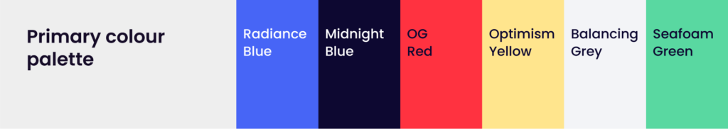
The colourful branding now reflects a curious and innovative collective of fun-loving people. We love what we do, and we want our brand to feel as inspiring as the work we aim to create for our customers. From the logo to the colour palette, the shapes, illustrations and iconography, we’ve chosen playful elements to showcase who we really are.
The connected thread
The Sitback brand shapes are an important visual element of our website. They convey the notion of building blocks – essential to all digital experiences. More important, however, is how we connect them. This is where the connected thread comes into play. The connected thread conveys movement and flexibility, and connection between the building blocks we use to draw people together. It perfectly illustrates how we join the dots together to provide exceptional experiences, and we must say, we love this visual element.
The website story
The historical Sitback website also deserved a refresh in line with the new brand, and we weren’t only concerned with how to improve it visually. It was important to us to make sure that our marketing team could update the site easily and that we didn’t burden our developers with requests for help that would take them away from valuable client face time.
We focused on building a reusable component-driven website that is both flexible and highly customisable. Our new website maintains originality across all pages but is built using just 12 individual components. We have been able to maintain “freshness” by making each component dynamic through playful animations, subtle fade-ins and outs, and masked reveals. Each nuance within the components not only reinforces our brand personality, but they are also able to be deployed by a person without a tech background.
Digital inclusivity is one of our highest priorities and we aim for WCAG 2.1 AA compliance. This aspect of the project goes beyond selecting the right colours and improving navigation. Instead of accessibility being an afterthought, we have had the opportunity to build a website that is accessible from the ground up. We are committed to a website experience that people of all needs will find a pleasure to use.
Our mission
Anyone who has ever been involved in a rebranding project knows that it is a complex process with many moving parts to the story. But the sense of accomplishment we feel at the launch of our new brand is nothing short of gratifying. We are proud to have inspired many customers with new websites, and we are very thrilled to have brought the Sitback brand up to the only standard we would accept for our customers – exceptional.